Small Text vs Tiny Text vs Small Caps vs Superscript vs Subscript
Compare small text, tiny text, small caps, superscript, and subscript by appearance, meaning, copy behavior, and best use.
Small text vs tiny text can sound like a simple battle of font sizes. Add small caps, superscript, and subscript, though, and things become more interesting.
These text styles may all look smaller than normal text. However, they do not serve the same purpose.
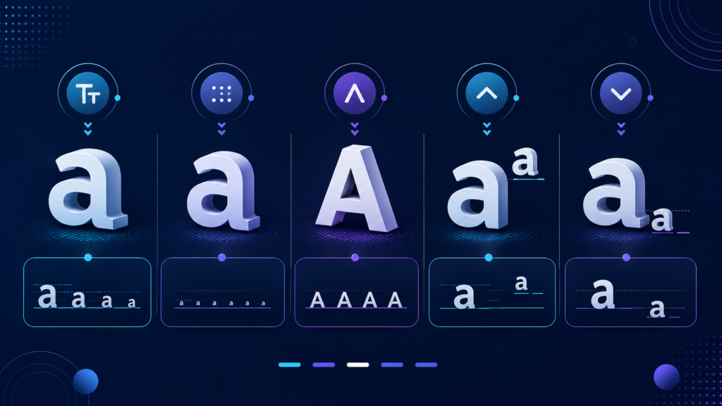
Small and tiny text mainly concern size. Small caps change the shape of letters. Meanwhile, superscript and subscript change a character’s vertical position.
On the web, those differences matter. HTML, CSS, Unicode, accessibility standards, and typography all treat them differently.
So, before shrinking a word until your readers need binoculars, it helps to know which style actually fits the job.
Small Text vs Tiny Text vs Small Caps vs Superscript vs Subscript
Here is the simplest comparison.
| Text style | Main change | Common purpose | Recommended web method |
|---|---|---|---|
| Small text | Font size | Fine print, notes, secondary information | <small> when semantically appropriate or CSS font-size |
| Tiny text | Very small font size | Compact labels or visual styling | CSS |
| Small caps | Letterforms | Abbreviations, labels, editorial typography | font-variant-caps: small-caps |
| Superscript | Raised baseline | Exponents and conventional superior text | <sup> |
| Subscript | Lowered baseline | Chemical formulas and mathematical indices | <sub> |
Therefore, the main difference is not simply “how small does the text look?” The real question is why the text looks different.
That distinction helps developers choose cleaner HTML and helps designers preserve readability.
What Is Small Text?
Small text usually means text that appears smaller than the surrounding copy.
In CSS, the font-size property controls this size. It accepts values such as small, x-small, and xx-small. You can also use relative units such as em, rem, and percentages.
MDN recommends relative sizing when possible because it can better respect a user’s preferred default font size.
However, HTML also includes the <small> element.
The <small> element has a specific purpose. MDN defines it as an element for side comments and small print, such as copyright information or legal text. Browsers usually render it one size smaller by default.
For example:
<small>Terms and conditions apply.</small>
Therefore, you should not use <small> simply because you want any random sentence to look smaller.
If appearance is your only goal, CSS gives you better control. If the content genuinely represents small print or a side comment, <small> makes sense.
What Is Tiny Text?
Tiny text does not have an official HTML element.
In other words, HTML has no <tiny> tag, and CSS has no standard tiny value for font-size.
CSS does provide size keywords such as xx-small, x-small, small, medium, and larger values. It also supports smaller, which calculates a size relative to the parent element.
Therefore, “tiny text” is mainly an informal design term.
One designer may call 11px text tiny. Another may reserve that description for something much smaller. The term describes appearance rather than semantic meaning.
That freedom creates a problem, though. Text can become too small to read comfortably.
Tiny copy may work for low-priority metadata in some interfaces. However, essential instructions, prices, warnings, navigation items, and buttons should remain easy to read.
A design should look compact, not like it lost a fight with a photocopier.
Small Text vs Tiny Text: Is There a Real Difference?
Yes, although the difference often depends on context.
“Small text” can refer to ordinary reduced font sizing. On the web, it may also refer to the semantic <small> element.
“Tiny text,” by contrast, has no special HTML meaning. It simply describes text that appears unusually small.
Therefore, small text vs tiny text is partly a technical distinction and partly a design distinction.
For semantic small print, <small> may work well. For purely visual sizing, use CSS.
Most importantly, do not make critical information tiny simply because a layout looks cleaner that way. A beautifully aligned interface becomes less beautiful when nobody can comfortably read it.
What Are Small Caps?
Small caps work differently from both small and tiny text.
They use capital-style letterforms at approximately the height of lowercase letters. As a result, they create the visual character of capitals without making every letter full-sized.
CSS provides the font-variant-caps property for this purpose.
For example:
font-variant-caps: small-caps;
MDN documents several related values, including small-caps, all-small-caps, petite-caps, all-petite-caps, unicase, and titling-caps.
A font with dedicated OpenType small-cap glyphs usually produces the best result. If those glyphs do not exist, a browser may synthesize small capitals from uppercase letters.
Therefore, small caps are not simply “normal capitals with a smaller font size.”
Designers often use them for abbreviations, labels, names, introductory phrases, and editorial typography.
However, moderation matters. MDN notes that long passages using all-small-caps or all-petite-caps may become harder to read for people with cognitive concerns such as dyslexia.
Use small caps for flavor, not for an entire novel unless you dislike your readers.
What Is Superscript?
Superscript raises text above the normal baseline. Browsers also tend to render it smaller than surrounding text.
A familiar example is an exponent:
x²
HTML provides the <sup> element for typographic conventions that require this raised position.
For example:
x<sup>2</sup>
Other examples include certain ordinal abbreviations and conventional superior lettering.
However, <sup> should not act as a general-purpose “move this text upward” tool. When a raised position exists only for decorative styling, CSS is usually the better option.
For complex mathematical expressions, MathML can describe relationships more accurately than basic HTML.
That becomes especially useful when an expression needs both subscript and superscript positions around the same mathematical symbol. MDN specifically points developers toward MathML for those richer structures.
What Is Subscript?
Subscript works in the opposite direction.
It lowers characters below the normal baseline and usually displays them at a smaller size.
Chemical formulas provide the classic example:
H₂O
In HTML, you can write it as:
H<sub>2</sub>O
Here, the lowered number carries meaningful information. The “2” tells us that a water molecule contains two hydrogen atoms.
MDN lists chemical formulas, mathematical variable numbers, and certain footnote conventions among appropriate uses for <sub>.
Again, use the element when typographic convention requires a subscript. If you only want to move decorative text downward, CSS gives you a presentation-focused option such as vertical-align.
Therefore, subscript is not simply “tiny text near the bottom.” Position and context give it its purpose.
Unicode vs HTML and CSS
Unicode makes this topic slightly more complicated.
You may have seen online text generators that produce small capitals, superscript-like letters, or other miniature characters. Those tools often replace regular letters with separate Unicode characters.
That is not the same as styling ordinary text with CSS.
Unicode’s Phonetic Extensions block, for example, contains small-capital, superscript, and subscript forms used in phonetic notation. Unicode explicitly explains that these forms serve cases where the style difference carries semantic importance.
For general text, Unicode recommends regular Latin, Greek, or Cyrillic letters with markup instead.
Therefore, a Unicode character that resembles a tiny letter should not automatically replace an ordinary letter.
Separate characters can behave differently during search, copying, case conversion, pronunciation, indexing, or text processing.
For regular web content, keep normal letters as normal letters. Then use HTML or CSS for presentation and conventional typography.
Accessibility and Readability Matter
Small typography needs extra accessibility care.
WCAG 2.2 Success Criterion 1.4.4 requires users to resize text up to 200% without losing content or functionality.
Therefore, test your design at higher zoom levels.
Labels should remain visible. Text should not disappear behind nearby elements. Buttons should still work, and important content should not become clipped.
WCAG also addresses user-controlled text spacing. Pages should tolerate increased line height, paragraph spacing, letter spacing, and word spacing without losing content or functionality.
Relative font units such as em and rem can also help create more scalable typography. MDN notes that relative lengths often work better when users change their preferred font size.
As a result, the smallest possible font is rarely the smartest possible font.
Which Text Style Should You Use?
Choose the style according to meaning first.
Use small text when secondary information needs less visual emphasis. Use the <small> element when that content genuinely acts as small print or a side comment.
Use tiny text only as a visual choice and keep readability in mind. It has no dedicated semantic HTML element.
Use small caps when you want capital-style letterforms for labels, abbreviations, names, or editorial typography. CSS font-variant-caps: small-caps usually provides the right approach.
Use superscript for conventional raised notation, such as exponents.
Finally, use subscript for conventional lowered notation, such as chemical formulas and variable indices.
Although these styles can look similar at first glance, they solve different problems.
A teaspoon and a soup ladle are both spoons. That does not mean you should stir your espresso with both.
Small Text, SEO, and AI Search
No special text style gives a page an automatic ranking boost.
Google recommends helpful, reliable, people-first content. It also advises publishers to use the terms people search for naturally in prominent places such as titles, headings, alt text, and link text.
Therefore, repeating “small text vs tiny text” every few sentences will not create better SEO.
In fact, Google classifies unnatural keyword repetition intended to manipulate rankings as keyword stuffing.
The same basic principles apply to Google’s AI search experiences. Google says pages do not need special AI-specific markup to appear in AI features. Instead, publishers should continue following foundational SEO practices and create useful, reliable content.
Clear definitions also help search and AI systems understand entities and their relationships.
For this topic, those entities include HTML <small>, <sup>, <sub>, CSS font-size, font-variant-caps, vertical-align, Unicode, MathML, WCAG, small caps, superscript, and subscript.
That semantic clarity is more valuable than stuffing the page with slight keyword variations.
Final Verdict
Small text, tiny text, small caps, superscript, and subscript may share a smaller appearance, but they do very different jobs.
Small text reduces visual emphasis and may use <small> when the content represents genuine small print. Tiny text simply describes an unusually small visual size.
Small caps change letterforms rather than merely shrinking letters. Superscript raises characters according to typographic convention. Subscript lowers them for conventions such as formulas and mathematical indices.
Therefore, choose each style according to meaning and context.
Use semantic HTML when the HTML element matches the purpose. Use CSS when you only need visual presentation. Use specialized Unicode characters when the character itself carries the required meaning.
Most importantly, keep the result readable.
Typography should make information easier to understand. If visitors need a magnifying glass, a chemistry degree, and three browser extensions just to read the footer, something has probably gone wrong.

Related Articles