Small Caps in Typography vs Unicode Small Caps
Compare real typographic small caps with Unicode lookalike characters, including font quality, CSS, copy behavior, and accessibility.
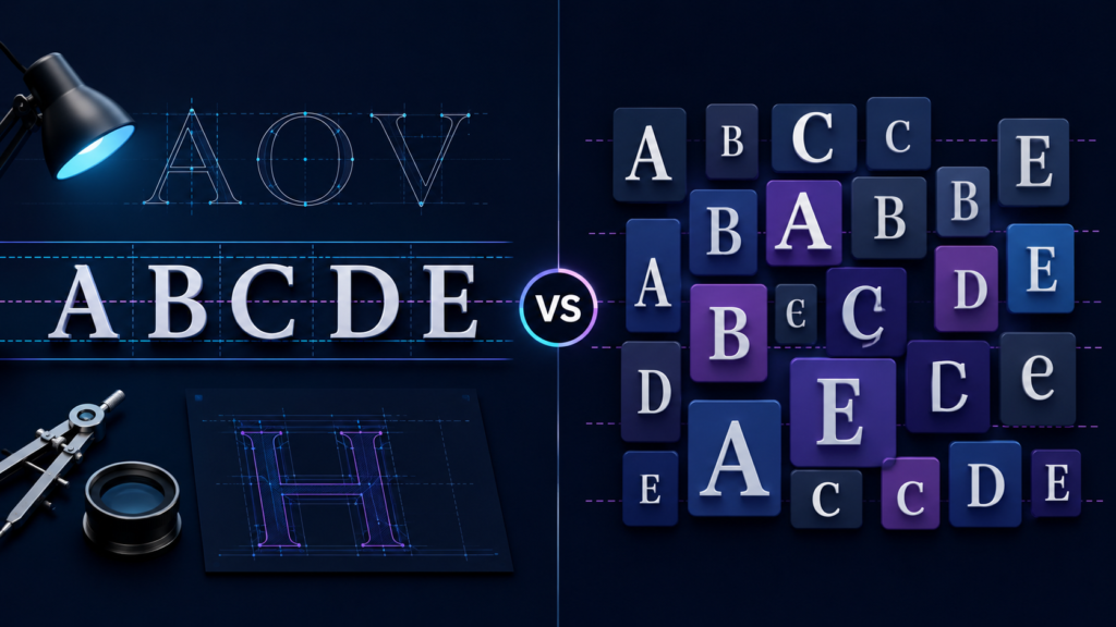
Small caps in typography vs Unicode small caps can look surprisingly similar on a screen. Underneath that appearance, however, they work in very different ways.
Typographic small caps change how ordinary letters appear. Unicode small-cap characters can represent separate characters with their own encoded values and linguistic purposes.
That difference matters more than it may seem.
If you design websites, work with fonts, publish digital content, or simply enjoy good typography, knowing which type to use can prevent messy text and unnecessary character substitutions.
The short version is simple: use typographic small caps for styling and Unicode small-cap characters when their character identity actually matters.
Now let’s look at why.
What Are Small Caps in Typography?
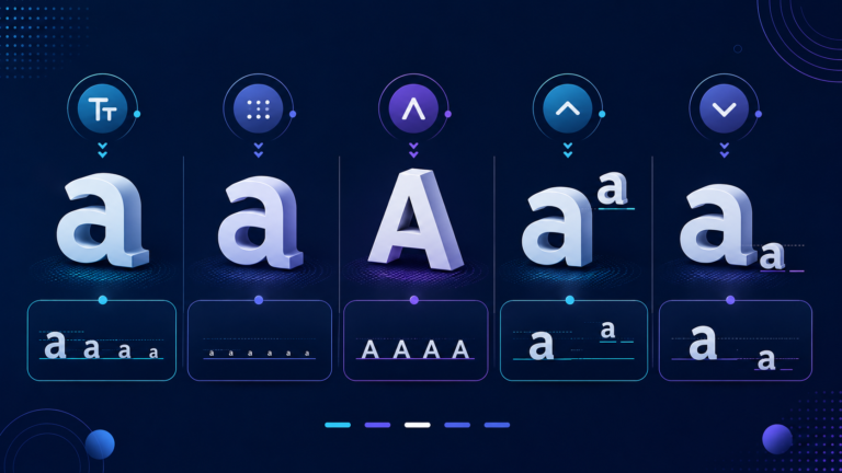
Small caps are capital-shaped letterforms designed to sit comfortably alongside lowercase text.
They usually appear around the size of lowercase letters rather than reaching the full height of regular capitals. A type designer can adjust their stroke weight, spacing, proportions, and shape so they blend naturally with the rest of the font.
For example, imagine an acronym such as NASA inside a paragraph.
Full capitals can visually dominate nearby lowercase words. Proper small caps can soften that effect while keeping the acronym distinct.
However, genuine small caps are not simply uppercase letters reduced in size.
A well-designed font includes dedicated small-cap glyphs. Those glyphs give the designer more control over weight and proportion, which helps them match surrounding text.
That distinction leads to another important topic: real small caps versus synthesized ones.
True Small Caps vs Synthesized Small Caps
A font with true small caps contains letterforms created specifically for that purpose.
When those glyphs do not exist, software may imitate the effect by shrinking regular capital letters.
Unfortunately, shrinking a letter also shrinks its strokes. As a result, synthesized small caps can look thinner or weaker than the lowercase letters around them.
The effect may be acceptable for casual use. In professional typography, though, dedicated glyphs usually produce a more balanced result.
Web browsers can also synthesize small-cap forms when a font lacks the required glyphs. MDN explains that browsers may fall back to uppercase glyphs when suitable small-cap forms are unavailable.
So, adding a CSS rule does not automatically guarantee beautiful small caps.
CSS can request them. The font still has to bring something useful to the meeting.
What Are Unicode Small Caps?
Unicode small caps are different because Unicode deals with characters, not merely visual styles.
The Unicode Standard includes several characters that resemble miniature capital letters. The Phonetic Extensions block, for example, contains characters such as:
ᴀ ᴄ ᴅ ᴇ ᴊ ᴋ ᴍ ᴏ ᴘ ᴛ ᴜ ᴠ ᴡ ᴢ
At first glance, they may look like convenient decorative versions of ordinary Latin letters.
That is not their general purpose.
The Unicode Consortium describes the small capitals in the Phonetic Extensions block as forms used mainly for phonetic representation, including the Uralic Phonetic Alphabet (UPA). In these contexts, their form can carry semantic meaning.
Unicode then gives very clear advice: for general text, writers should use regular Latin, Greek, or Cyrillic letters with markup instead.
Therefore, a Unicode character that looks like a tiny capital letter should not automatically become a substitute for normal text.
Appearance and identity are two different things.
Small Caps in Typography vs Unicode Small Caps
The easiest way to understand the difference is to compare what happens underneath the visible text.
| Attribute | Typographic Small Caps | Unicode Small Caps |
|---|---|---|
| Primary purpose | Typography and visual styling | Linguistic or phonetic meaning |
| Underlying characters | Usually normal letters | Separate Unicode characters |
| Controlled by | Fonts, OpenType and CSS | Unicode code points |
| Suitable for normal website styling | Yes | Usually no |
| Character identity changes | No, in normal use | Yes |
| Typical technologies | smcp, c2sc, CSS | Unicode Phonetic Extensions |
| Example | Styled ordinary text | ᴀ, ᴅ, ᴛ, ᴠ |
The two approaches may create a similar visual impression. However, the underlying data can be completely different.
That is the central distinction.
How OpenType Creates Real Small Caps
Modern fonts often use OpenType features to provide professional small-cap typography.
One of the most important features is smcp, short for Small Capitals.
Microsoft’s OpenType specification explains that smcp maps lowercase glyphs to corresponding small-cap forms. In other words, the text can keep its normal characters while the font displays alternate glyphs.
OpenType also defines c2sc, which means Small Capitals From Capitals.
This feature maps capital glyphs to their small-cap equivalents. The OpenType specification notes that it can help with words such as acronyms that would otherwise appear in full capitals. Adobe originally registered the c2sc feature.
These features matter because they separate content from presentation.
The letters remain meaningful characters. The font decides how they look.
That is a much cleaner approach than swapping ordinary letters for unrelated Unicode characters just to create a visual effect.
How to Use Small Caps Correctly With CSS
CSS gives web developers a straightforward way to request small caps.
For standard small caps, use:
.small-caps {
  font-variant-caps: small-caps;
}
MDN states that the small-caps value enables the OpenType smcp feature.
If you want both uppercase and lowercase letters to appear as small capitals, CSS also provides:
.all-small-caps {
  font-variant-caps: all-small-caps;
}
In this case, CSS uses the OpenType c2sc and smcp features where supported.
This approach lets your HTML contain ordinary text.
For example, your source can still contain the word Typography rather than a collection of visually similar phonetic characters.
CSS then handles the presentation.
That separation makes the document easier to maintain and keeps the original character sequence intact.
Why Unicode Small Caps Should Not Replace Normal Text
Online “small caps generators” often create text by substituting ordinary letters with Unicode characters that happen to resemble small capitals.
Visually, the result can be entertaining.
Technically, it is character substitution.
Suppose a tool transforms ordinary letters into characters such as ᴛ, ᴜ, or ᴠ. Those characters have their own Unicode code points. They are not simply a font style applied to T, U, and V.
This distinction matters because Unicode encoded many of these characters for specific linguistic purposes.
In the Uralic Phonetic Alphabet, for example, Unicode explains that small capitalization can indicate phonetic properties such as voicelessness.
So, using these characters as decorative replacements ignores the reason they exist.
For a social-media nickname, someone may still choose the visual effect. For articles, navigation, headings, documentation, product names, and other meaningful website text, ordinary characters plus proper styling offer the cleaner solution.
Is There a Complete Unicode Small-Caps Alphabet?
Not in the way many “small caps converter” websites suggest.
Unicode contains numerous small-cap-shaped characters across phonetic and linguistic blocks. However, it did not create a complete decorative A-to-Z small-caps font for ordinary English typography.
For example, Unicode identifies ᴀ as Latin Letter Small Capital A, ᴅ as Latin Letter Small Capital D, and ᴛ as Latin Letter Small Capital T.
Their existence does not mean authors should assemble them into a replacement alphabet.
In fact, Unicode’s recommendation points in the opposite direction. For ordinary text, use standard letters and apply markup or typography when you need a stylistic change.
A so-called Unicode small-caps alphabet is therefore usually a collection of lookalike characters, not the equivalent of switching on a font feature.
Small Caps, SEO, and Machine-Readable Text
For normal web content, standard letters provide the clearest representation of the words you actually intend to publish.
Google Search Central recommends using clear language and terminology that users understand. Google also says its systems can understand what a page covers without writers repeating every possible keyword variation.
That point matters here.
There is no SEO benefit in replacing ordinary words with unusual Unicode characters just because they look distinctive.
Google does not publish an “optimal keyword density,” either. Its guidance focuses on making a page explicit, relevant, useful, and understandable rather than repeatedly inserting a phrase.
Therefore, use small caps because they improve typography or communicate a real linguistic distinction.
Do not use them as an SEO trick.
Search engines have enough work already. They do not need a costume party in every heading.
Small Caps and Accessibility
Small caps can improve hierarchy when designers use them carefully. However, more is not always better.
They often work well for short acronyms, labels, headings, names, or introductory phrases.
Large passages require more caution.
MDN warns that extensive text displayed with all-small-caps or all-petite-caps may become difficult to read for people with some cognitive concerns, including dyslexia.
Therefore, keep long body copy in a conventional, highly readable form.
Small caps should support the hierarchy of a page, not become the page.
When Should You Use Typographic Small Caps?
Use typographic small caps when appearance is your main goal.
They can work well in:
- abbreviations and acronyms;
- short headings or labels;
- book and editorial typography;
- names or introductory phrases;
- branding systems where the typeface supports genuine small-cap glyphs.
For web projects, choose a suitable OpenType font and use font-variant-caps where appropriate.
Also, test the actual result. A browser may synthesize small caps when the font lacks dedicated glyphs, so two typefaces can produce noticeably different results.
When Should You Use Unicode Small-Cap Characters?
Use a Unicode small-cap character when that specific character carries the meaning you need.
Phonetics provides the clearest example.
The Unicode Consortium specifically identifies small capitals in the Phonetic Extensions block as characters for phonetic representation where stylistic differences can have semantic importance.
In that situation, replacing the character with ordinary typography could remove information.
For general English prose, however, the opposite rule applies.
If you only want something to look like small caps, use typographic styling.
If the exact encoded character carries meaning, use the appropriate Unicode character.
Frequently Asked Questions
Are Unicode small caps the same as typographic small caps?
No. Typographic small caps normally use alternate font glyphs while preserving ordinary characters. Unicode small-cap characters can have separate code points and specific semantic purposes.
Is CSS better than Unicode small caps for normal website text?
Yes, when your goal is visual styling. CSS lets you retain ordinary text while requesting small-cap glyphs from the font. Unicode itself recommends ordinary letters with markup for general text.
What is the OpenType smcp feature?
smcp means Small Capitals. It maps lowercase glyphs to corresponding small-cap glyphs when the font provides them.
What does c2sc mean?
c2sc means Small Capitals From Capitals. It maps capital glyphs to their small-cap forms and is useful when full capitals, such as acronyms, need a small-cap appearance.
Do all fonts contain true small caps?
No. Some fonts include dedicated small-cap glyphs, while others rely on synthesized versions. Browsers may create an approximation from uppercase glyphs when genuine small caps are unavailable.
Are Unicode small caps bad for SEO?
There is no credible Google rule stating that the mere presence of Unicode small-cap characters causes a ranking penalty.
However, you should use characters according to their intended meaning. For ordinary web text, normal letters with CSS or font styling provide the clearer and more appropriate solution.
Final Thoughts
The difference between small caps in typography vs Unicode small caps comes down to one crucial idea: presentation versus character identity.
Typographic small caps let OpenType and CSS change how ordinary letters appear. Features such as smcp and c2sc can select dedicated small-cap glyphs without turning your text into a different sequence of Unicode characters.
Unicode small caps serve another purpose. Many exist because phonetic or linguistic systems need small-cap-shaped characters with semantic meaning.
For ordinary websites, articles, interfaces, and publishing projects, keep your underlying text conventional and let the font handle the styling.
Use Unicode characters when you genuinely need those characters.
It is cleaner typography, cleaner data, and a much more sensible division of labour.
After all, a letter should not need a new identity just because you gave it a smaller suit.

Related Articles