Unicode Small Text vs CSS Font Size vs Real Typography
Compare Unicode replacement characters, CSS font sizing, and professional typography for social posts, websites, documents, and accessible design.

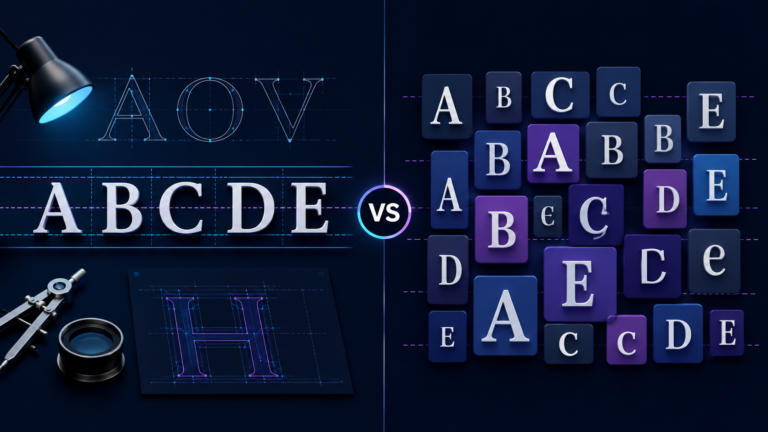
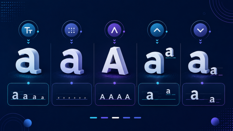
Unicode small text, CSS font size, and real typography can create similar visual results. However, they work in very different ways. One changes characters, one changes rendered size, and one uses a broader typographic system.
That distinction matters on the web because it affects accessibility, consistency, semantic meaning, and text processing. If you use a small text generator, you should know which tool solves which problem.
What Is Unicode Small Text?
Unicode small text usually comes from special Unicode characters that already look small, raised, lowered, or similar to small capitals.
A generator may replace ordinary letters with modifier letters, superscript characters, subscript characters, or phonetic small-capital forms. The text can therefore look smaller even when no CSS has changed its font size.
The key point is simple: the underlying characters may be different.
Unicode mainly encodes plain-text characters. It does not provide a general system for visual styling such as font size, weight, kerning, or arbitrary superscripting. The Unicode Consortium recommends markup or styling for general rich-text effects.
That is why Unicode small text can behave differently when you copy it. You are often copying special code points, not ordinary letters displayed at a smaller size.
Unicode Small Text Is Not a Complete Small Alphabet
Many small-looking Unicode characters exist for linguistic, phonetic, mathematical, or compatibility reasons. Unicode did not create them as a decorative replacement alphabet for normal Latin text.
For example, Unicode includes modifier letters and some superscript or subscript characters. However, the Unicode Standard says these do not form a general styling system.
A miniature-looking letter can still be a different character. Code points have paperwork.
How CSS Font Size Works
CSS font-size changes how large a browser renders text. It does not normally replace the underlying characters.
Suppose your HTML contains the word Typography. You can display it at a different size with CSS:
.note {
  font-size: 0.875rem;
}
The browser still receives the same letters. CSS simply controls their rendered size.
MDN documents keywords, percentages, px, em, and rem as valid ways to set font size. It also recommends relative sizing when you want to respect user preferences and support accessible scaling.
Therefore, CSS font size is usually the right choice when your goal is purely visual.
px, em, and rem Are Different Tools
Pixels provide precise sizing, while relative units often fit flexible interfaces better. An em value can compound through nested sizing, while rem relates to the root element’s font size.
Whatever unit you choose, text should remain usable when readers zoom or enlarge it.
Unicode Small Text vs CSS Font Size
The clearest comparison starts with one question:
Did you change the character, or only its visual size?
With Unicode small text, a tool may substitute a normal letter with another Unicode character. With CSS font-size, the original text stays in place while the browser changes its size.
Copying and Pasting
CSS-sized text usually copies as the original characters because CSS controls presentation.
Unicode small text copies as the actual Unicode characters in the string. Therefore, the pasted result can retain those special forms even where no CSS exists.
Search, Matching, and Data Processing
Two characters can look similar while having different Unicode code points. Software may treat those strings differently during exact matching, validation, sorting, filtering, or other text-processing tasks.
This does not mean Google automatically penalizes decorative Unicode. Google publishes no rule that says decorative Unicode alone causes a ranking penalty.
However, publishers should not assume visually similar text is technically identical. For important headings, navigation labels, product names, or search-focused copy, ordinary characters often avoid unnecessary ambiguity.
Google’s Search Essentials also recommends using words people would search for in prominent locations such as titles and main headings.
Font and Platform Consistency
Unicode defines characters, while fonts provide visible glyphs. As a result, a special character can look different across fonts, operating systems, and applications.
CSS gives designers more control over size because it works inside the site’s existing font and layout system.
What Real Typography Adds
Real typography is broader than font size. It includes font family, size, weight, line height, spacing, hierarchy, proportions, and available OpenType features.
Those choices help readers understand headings, labels, body text, and notes. Typography gives text a job description; smaller size is only one line on it.
Real Small Caps With font-variant-caps
CSS provides font-variant-caps for small capitals and related variants.
.label {
  font-variant-caps: small-caps;
}
MDN explains that small-caps corresponds to the OpenType smcp feature. When a font provides proper small-cap glyphs, the browser can use them. If the font lacks them, the browser may synthesize the effect.
True small-cap glyphs can match a typeface’s weight and proportions more carefully.
Either way, font-variant-caps keeps typography in the styling layer instead of replacing normal letters.
Superscript and Subscript Need the Right Tool
Unicode contains superscript and subscript characters, but the Unicode Standard does not recommend them for arbitrary superscripting or subscripting.
For general rich text, Unicode points developers toward markup or styling. HTML already provides <sup> and <sub> for common typographic conventions.
<p>E = mc<sup>2</sup></p>
<p>H<sub>2</sub>O</p>
MDN lists exponents as an appropriate use for <sup>. It also explains that the element should follow typographic conventions instead of serving as a general visual-positioning trick.
Therefore, these elements should represent an appropriate typographic convention, not act as random decoration. If you only want to move a decorative word above the baseline, CSS may be more suitable.
Accessibility: Small Text Still Has to Be Readable
Technical correctness does not help much if readers need a magnifying glass and optimism.
WCAG 2.2 Success Criterion 1.4.4 states that, with specified exceptions, users must be able to resize text up to 200% without losing content or functionality.
That requirement does not mandate rem or ban px. Instead, the page needs to continue working when users enlarge text through a supported mechanism.
W3C lists techniques that use percentages and em values, among other approaches. The practical goal remains simple: do not let enlarged text become clipped, hidden, or unusable.
Which Option Is Better for SEO?
For normal web pages, semantic HTML with standard text and CSS styling is usually the cleanest publishing approach.
Google’s Search documentation focuses on helpful, reliable, people-first content. It recommends clear titles, useful headings, well-organized sections, natural language, and words people may use when searching.
Google also warns against keyword stuffing. Repeating a phrase until it sounds unnatural does not turn weak copy into strong SEO.
If your page targets the phrase Unicode small text, use it naturally where it helps the reader. Decorative Unicode should not become a keyword tactic.
Google’s guidance focuses on natural language instead of prescribing a magic keyword-density target. Google also explicitly says it does not have a preferred word count for ranking.
So, focus on covering the topic clearly rather than chasing a magic number.
What About AI Search?
The same foundation applies to Google’s AI search experiences.
Google’s current guidance tells creators to focus on unique, useful, reliable, and non-commodity content. Its guidance for generative AI features builds on the same fundamental SEO practices used for Google Search.
That guidance does not ban decorative Unicode. It simply reinforces a practical rule: keep important content clear, useful, and easy to interpret.
Clear headings, accurate terminology, semantic HTML, and useful explanations also make the page easier for human readers to navigate.
When Unicode Small Text Makes Sense
Unicode small text can still be useful.
It may work in plain-text environments where CSS and rich formatting are unavailable. People also use small-looking characters in social posts, usernames, profile text, or decorative labels.
More importantly, use Unicode modifier letters, phonetic symbols, superscript forms, and other characters when you actually need their intended meanings. The Unicode Standard specifically recognizes specialized uses for many modifier, superscript, and subscript characters.
Intent decides the right tool.
If you need a real Unicode character, use that character. If you only need website text to look smaller, use CSS. If you need a typographic convention, use the appropriate HTML or font feature.
Unicode Small Text vs CSS Font Size: Quick Comparison
| Method | What changes? | Best use | Main consideration |
|---|---|---|---|
| Unicode small text | Characters may change | Plain-text effects or genuine Unicode characters | Copying and processing may preserve different code points |
CSS font-size | Rendered size | Website text sizing | Keep scaling and accessibility in mind |
font-variant-caps | Glyph presentation | Small-cap typography | Quality depends on font support and synthesis |
<sup> and <sub> | Typographic presentation | Exponents, formulas, conventions | Do not use only for decoration |
| OpenType typography | Font glyph features | Refined typography | The font must support the desired feature |
Final Verdict: Unicode Small Text, CSS Font Size, or Real Typography?
Unicode small text, CSS font size, and real typography can look similar, but they are not the same technology.
Unicode small text may change the encoded characters. CSS font-size changes the visual size of ordinary text. Real typography uses CSS, HTML structure, font metrics, and OpenType features to build a coherent reading experience.
For most website content, keep the underlying text normal and let CSS handle visual size. Use semantic HTML for established typographic conventions. Use specialized Unicode characters when you genuinely need those characters.
That approach keeps content clearer and easier to maintain.
The web already has several tools for making text small. The clever part is not finding the tiniest tool; it is choosing the one that fits the job.

Related Articles